


HOW-TO GUIDES
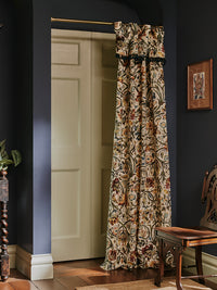
HOW TO HANG WALLPAPER PERFECTLY
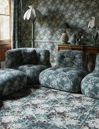
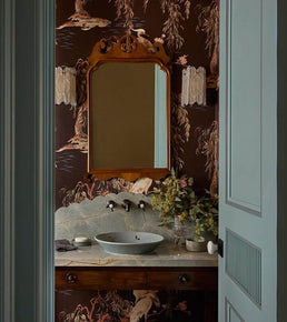
Our House is open to all: from those who know their way around a roll of wallpaper (or at least think they do) to those who are only familiar with a scroll through Pinterest. Which is why, since day one, it has been our mission to demystify the interior design process and to empower everyone with both the knowledge and fearlessness to decorate their own homes, dictated only by personal taste.
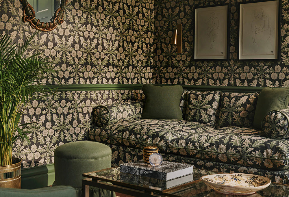
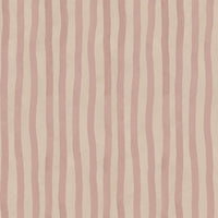
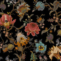
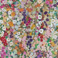
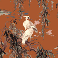
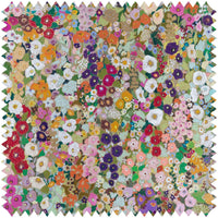
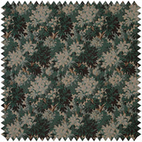
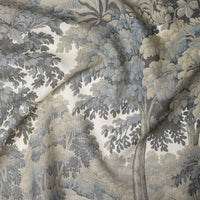
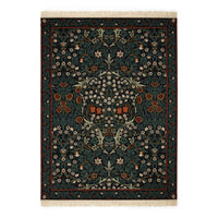
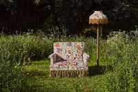
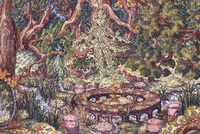
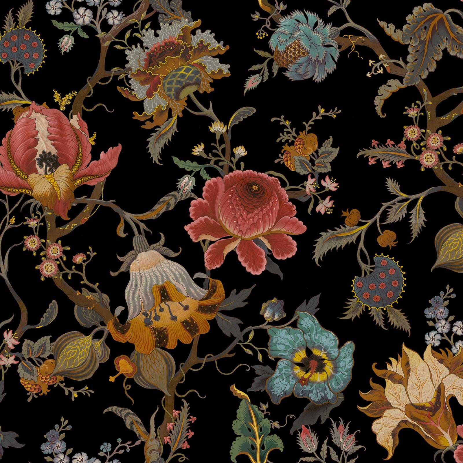
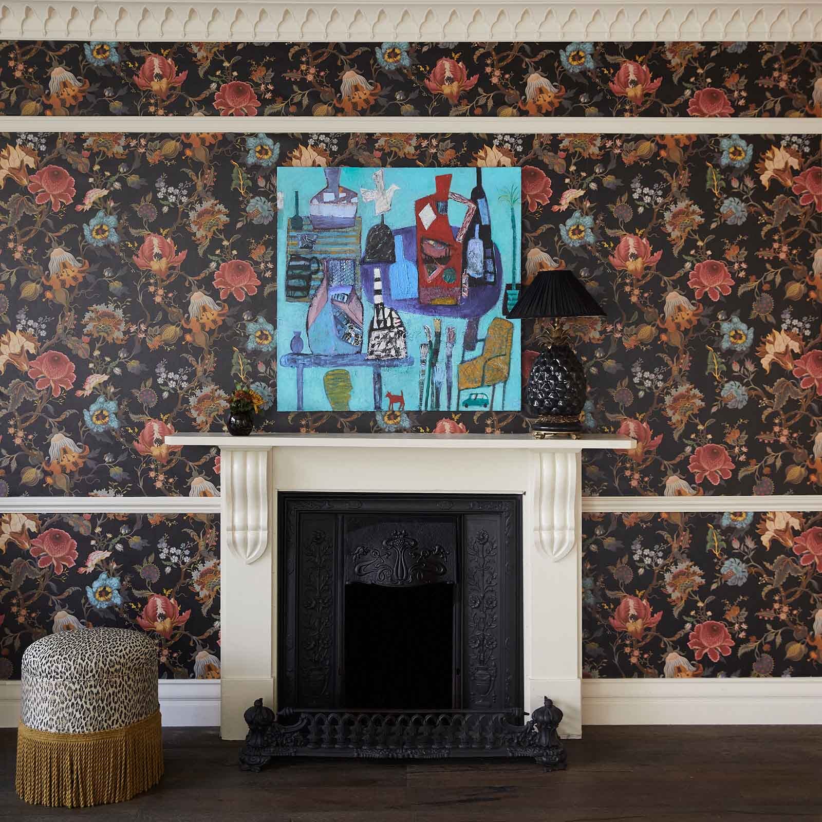
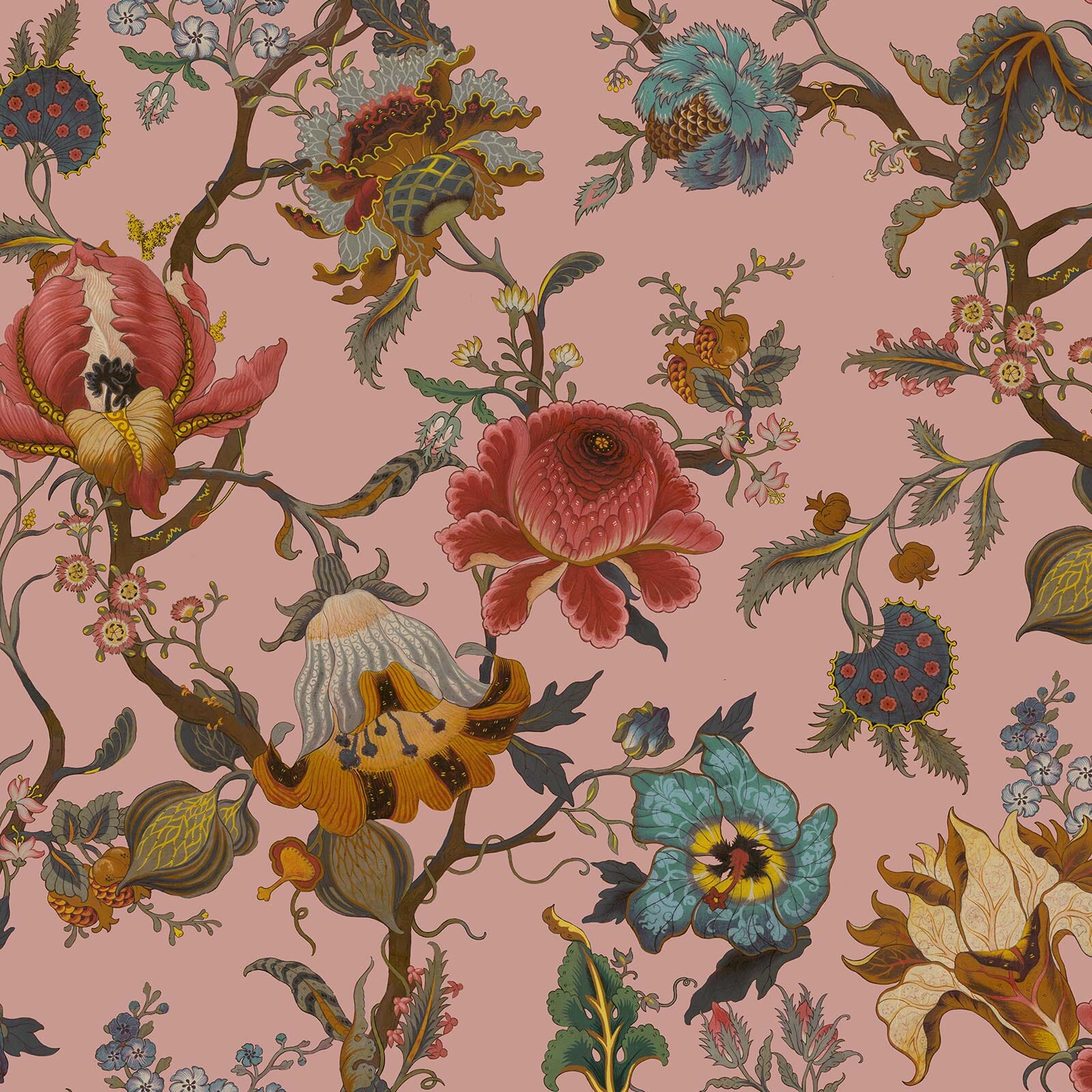
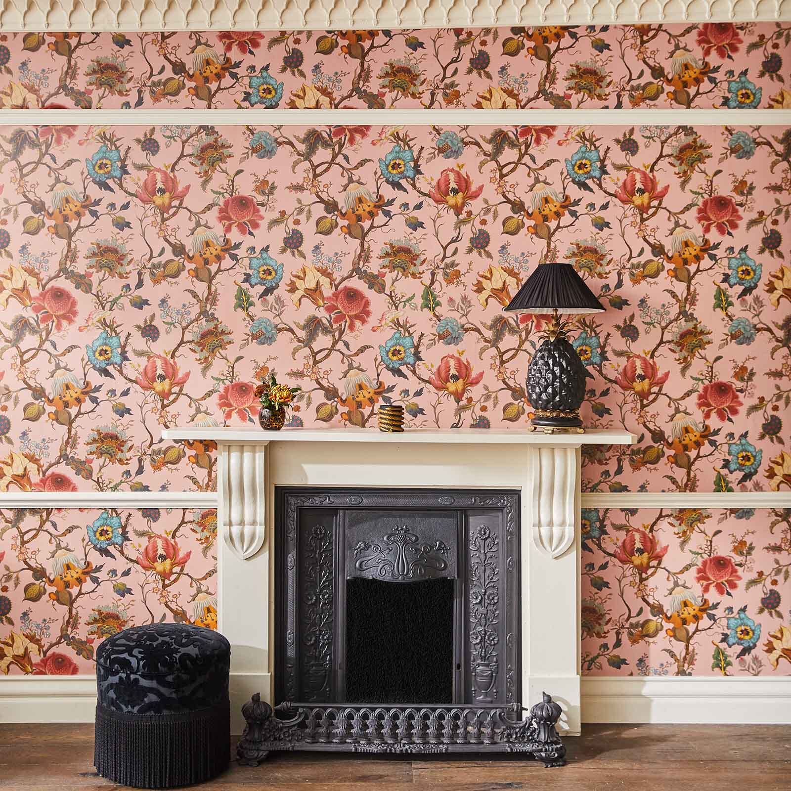
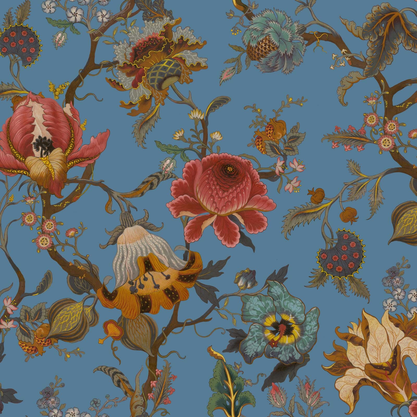
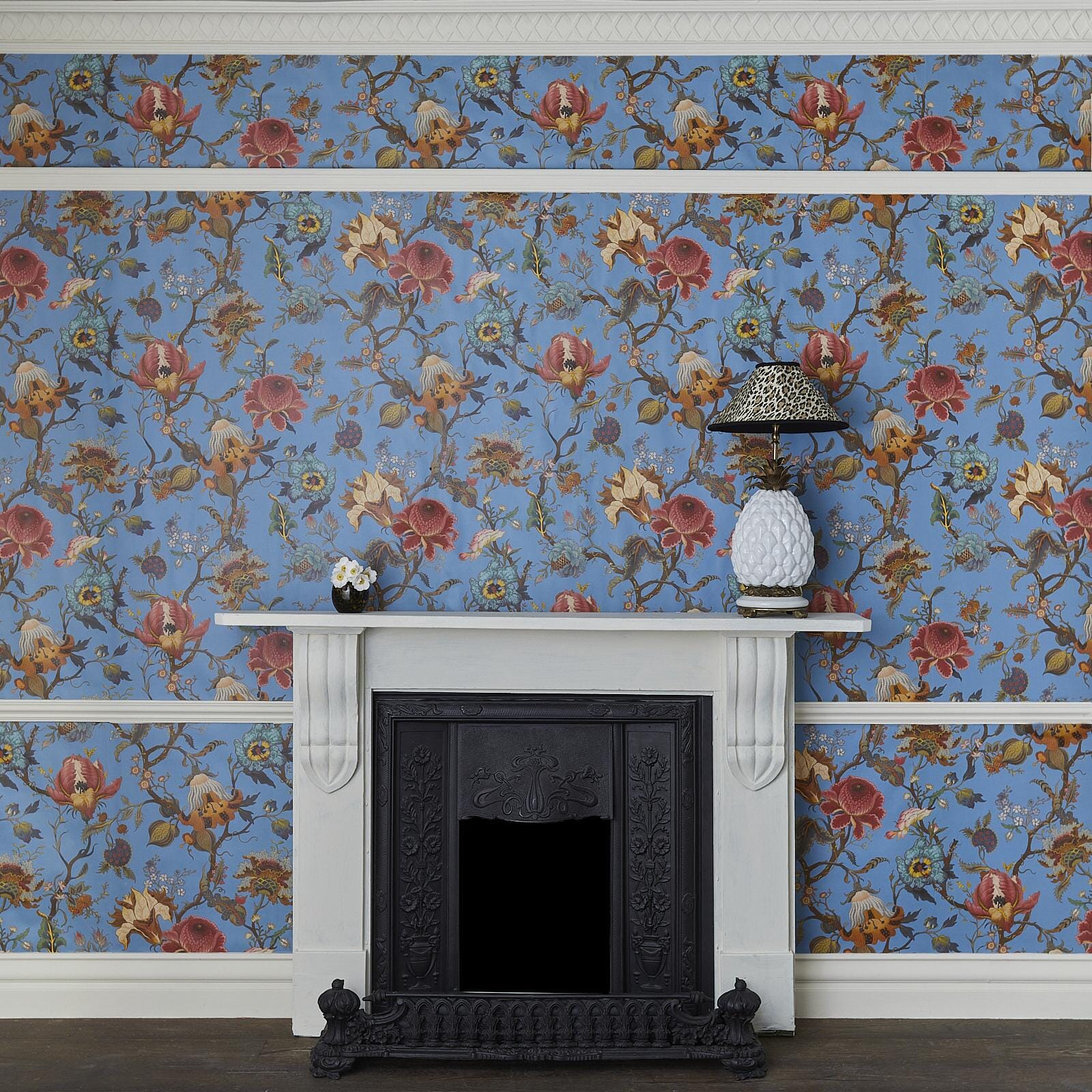
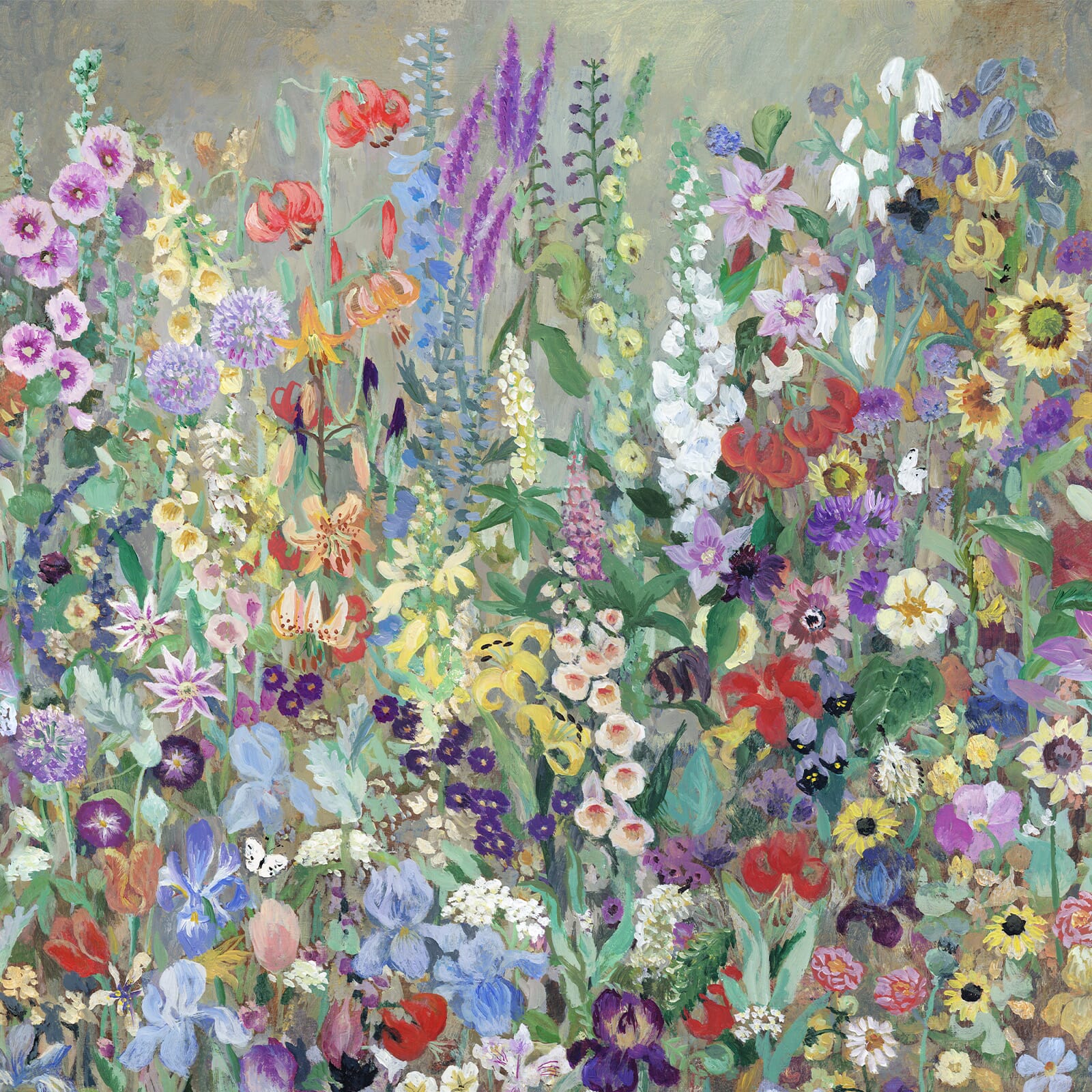
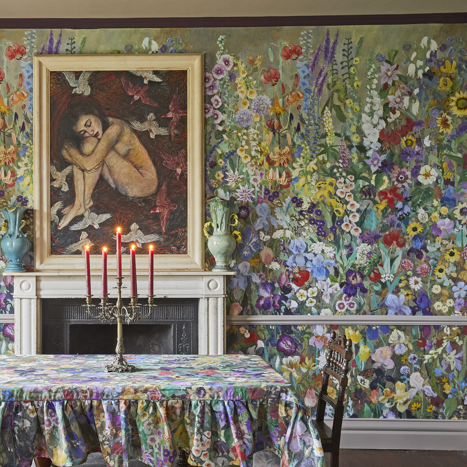
So, what is it you want to see around you: a garden of painterly blooms? A fairy-tale landscape roamed by dragons?Or perhaps a serene forest of bamboo? Whatever it may be, we’re here to help you create your own wonderwalls.

1/4
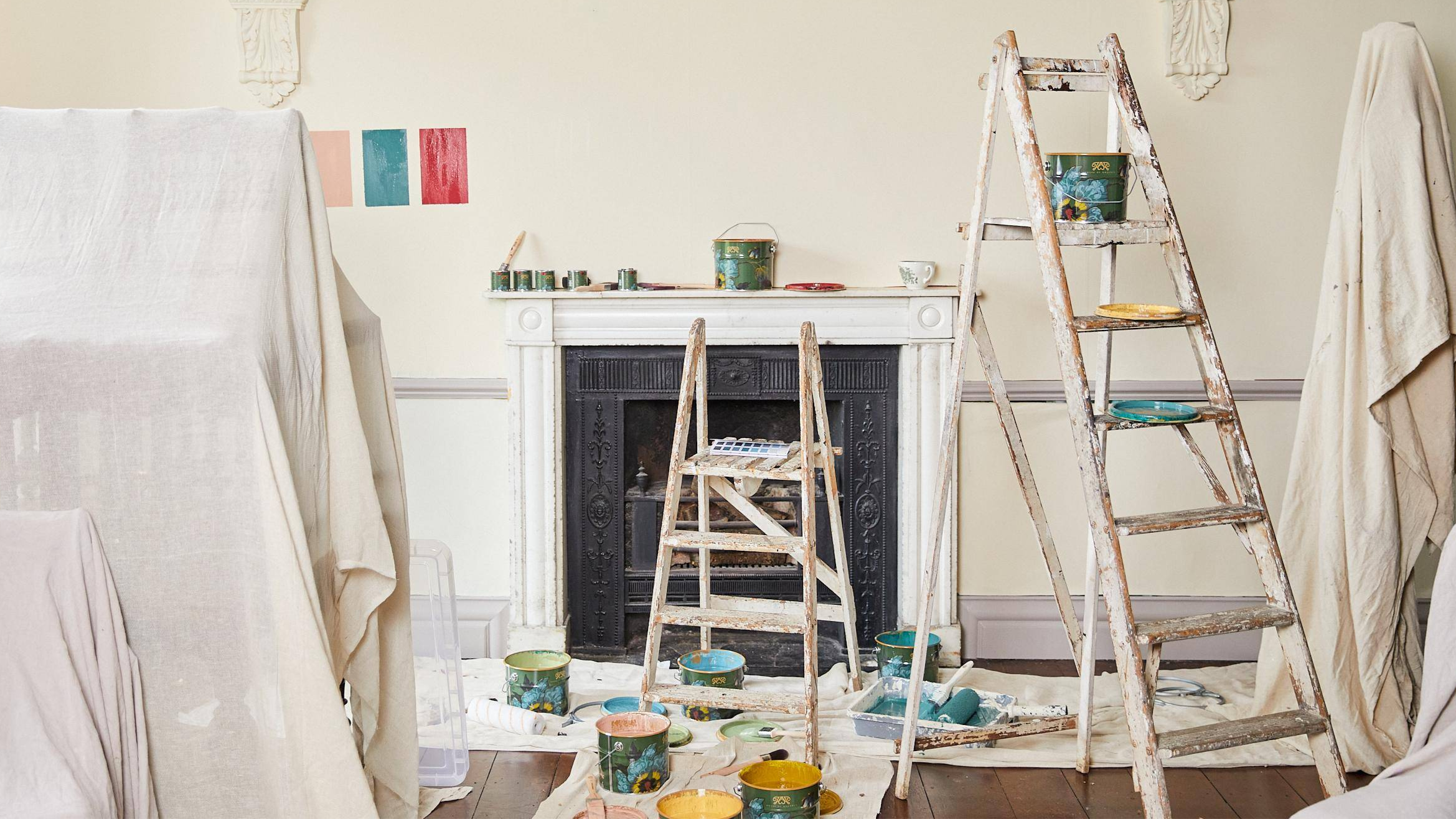
TOOLS OF THE TRADE
Our PVC-free designs not only go easy on the environment, but also go easy on you: incredibly simple and straightforward to hang - all it takes is a swipe of adhesive paste and a little insider know-how.
Here’s every tool you need to coat your walls with wonder:
You’ll need a brush, a roller and tray, a plumb line, a firm sponge, a kettle, a knife and an edge cutter. Oh, and a ladder. While that sounds like a lot, our wallpaper is very easy to hang once you have the right tools – keep scrolling for our step-by-step.

2/4
PRIME AND PREP
If you’re working on a newly plastered wall, you’ll need to seal the wall with primer to prevent the paste from being absorbed by the plaster, which could cause the paper to shrink.
Trade tip: It’s a good idea to paint the wall in the same colour as the background of your wallpaper, as this will prevent any visible lines where the seams meet.

3/4
CUT AND PASTE
Our favourites are the Beeline 'Yellow Top Wallcovering adhesive' and Solvite’s ‘Paste the Wall’. Alternatively, you can use any water-based, pre-mixed paste that is good quality and suitable for the paste-the-wall application method.
Trade tip: If you’re wallpapering a bathroom or a very busy area in the house such as the entrance hall, we suggest applying two coats of decorator’s varnish (we recommend Polyvine in ‘Dead Flat’, which has a matte finish) over the top using a short-flock roller, ensuring the wallpaper is dry first. As well as sealing the wallpaper, this will help to enhance its longevity, protecting against finger marks and scuffing.

4/4
AIR IT OUT
Turning off any central heating and ensuring the room is well-aired before during and after both the application and drying time will prevent your wallpaper shrinking and leaving visible gaps between the panels.
Then, do your best to wait 48 hours before turning the heating back on.
Remember our tips above on wallpapering over newly plastered walls to avoid wallpaper shrinking.

1/3
HOW TO HANG WALLPAPER
1. Roll out each sheet and cut to the 2m or 3m drop mark, then arrange the rolls in order (the sheets are numbered #1 to #4, so you’ll know which is which).
2. Using a plumb line, mark a point 40cm in from the far left of the wall (allowing for a 5cm overhang onto the adjacent wall) and draw a vertical straight line with the help of a wallpaper edge cutter.
3. Next, we recommend painting rough stripes on the walls at 45cm intervals, using emulsion paint in a hue that matches the base colour of the wallpaper. Ensuring that if any wallpaper shrinkage occurs, it won’t be visible.
Trade Tip: For sockets and switches, start by unscrewing and removing the outer casing. Apply the sheet of wallpaper as normal and let it hang over the socket area.
Next, use a knife to slice a cross-shaped opening, diagonally from corner to corner across the socket area, then cut away the excess. Smooth the paper down with a brush or sponge before reattaching the front cover of the socket.

2/3
LINE UP YOUR PRINT
4. Apply the ready-made paste to the wall sparingly, switching to a brush for the edges.
5. Position sheet #1 at the top of the wall (allowing a 5-10cm overlap onto the ceiling), with its right-hand edge running down the vertically drawn line.
6. Smooth the sheet down with a firm, dampened sponge, working in circular motions. motions. Take care not to stretch the paper as it becomes very pliable when wet with paste.
Trade tip: Use a sponge, never a spatula which could scratch the design.

3/3
A FLAWLESS FINISH
7. Align the top of sheet #2 with the first, then apply to the wall, side-matching the pattern repeat next to the edge of sheet #1.
8. Repeat step 7 with all four sheets, using as many rolls as required.
9. Trim off any excess paper along the top and bottom.
Print to Order
If you've still got some questions, we've listed some of our wallpaper frequently asked questions, below. Or you can contact us on Live Chat, or send us an email here.
What is your wallpaper made from?
Each roll is crafted at a little factory at the forefront of sustainability. One that sources its wood pulp from young trees, not ancient ones, grown purposefully in a forest managed to the FSC’s standards. One that prints our PVC-free creations in small batches, avoiding unnecessary waste before ingeniously powering its machinery with recycled energy generated from the off-cuts. The result is some of the most eco-friendly wallpaper produced in the world.
How long will my wallpaper take to produce?
Made to order, each roll is ready for delivery in 5-7 business days.
How do I measure my wallpaper?
Our online wallpaper calculator makes it easy to work out how many rolls to order – simply enter the height and width for each of the walls you would like to decorate, then we’ll do the maths. Alternatively, our in-house experts are on the other end of the line, happy to advise. Top tip: Always have a little extra on hand. For the average room we recommend that you purchase one additional roll to account for those further fiddly bits, such as reveals, overhangs, boxing around pipework etc.
How do I calculate for bespoke measurements?
We can cater to bespoke orders that will be custom printed to your specifications. We will add 20cm to the height and width of the walls to ensure there is enough paper to trim back for a high-quality finish. Contact us here.
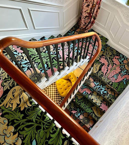
How do I calculate for stairways?
When it comes to stairways, take note of the greatest wall height and width, then order bespoke wallpaper based on those measurements – you can then team this with our regular-height wallpaper to cover adjoining hallways or landings.
How do I calculate for above dado rails and tiles?
Our 2m length is designed specifically for creating half-walls of print against dado rails, panelling or tiles, with the added bonus of less wastage.
Which wallpaper paste should I use?
Our favourites are the Beeline 'Yellow Top Wallcovering Adhesive' and Solvite’s ‘Paste the Wall’. Alternatively, you can use any water-based, pre-mixed paste that is good quality and suitable for the paste-the-wall application method.
How do pattern repeats work?
Our wallpaper works a little differently. There are 4 panels to every roll, (the sheets are numbered 1 to 4, so you’ll know which is which). Each panel measures 45 cm in width and either 200 or 300 cm in length. The pattern will automatically align across the panels so that you do not need to try and align the print or account for the repeat during installation.
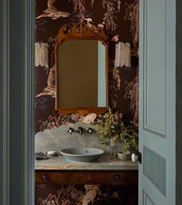
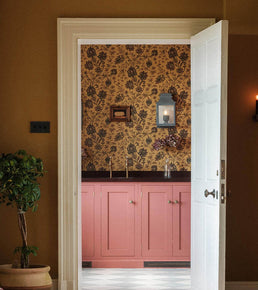
Can I use your wallpaper in kitchens and bathrooms?
Yes, our wallpaper is very hard-wearing – however we do advise that it is kept as dry as possible. We recommend sealing the wallpaper using a clear decorator’s varnish (our favourite is by Polyvine in ‘Dead Flat’), applied over the top of the wallpaper (once dry) using a short-flock roller. While enhancing the wallpaper’s longevity, this will also help to protect against splashes and stains.
How do I clean my wallpaper?
If you ever need to clean your wallpaper, lightly dust with a microfibre cloth or wipe it gently with a damp (not soaking) cloth.
How do I wallpaper around corners?
Internal
- Apply your paste up and into the corner.
- Make sure to match the edge of your paper into the corner, if needed follow it around by 2-3 cm.
- Match up to the line of your previously hung piece - this may cause the paper to overlap with the adjoining wall.
- Cut back the overlapping paper.
- Push down the paper ensuring it meets the wall perfectly.
External
- As you come to an external corner, wrap your wallpaper around it. If this causes overlap, cut back the overlapping paper.
- Push down the paper ensuring it meets the wall perfectly.
Top tip: If any overlap remains on your external corner ensure this stays wrapped around the corner and out of sight.
How do I remove your wallpaper?
Our wallpaper is designed with durability in mind, but we know that not all of us own our personal sanctuaries - or perhaps you just fancy giving a different House of Hackney print a go. To remove our wallpaper we recommend using a steam stripper.
Want more?