


STORIES
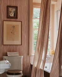
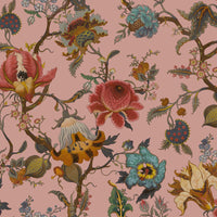
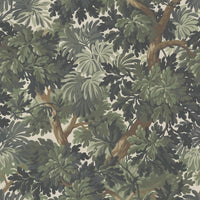
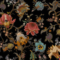
From stylish interiors and interviews with designers and dreamers to home decor ideas and DIY tips, there’s a world of inspiration to discover with House of Hackney.
Showing 6 of 19 results
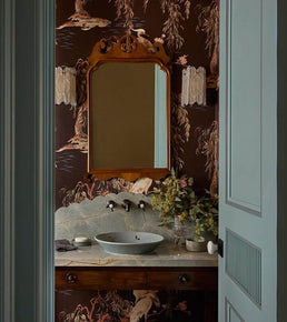
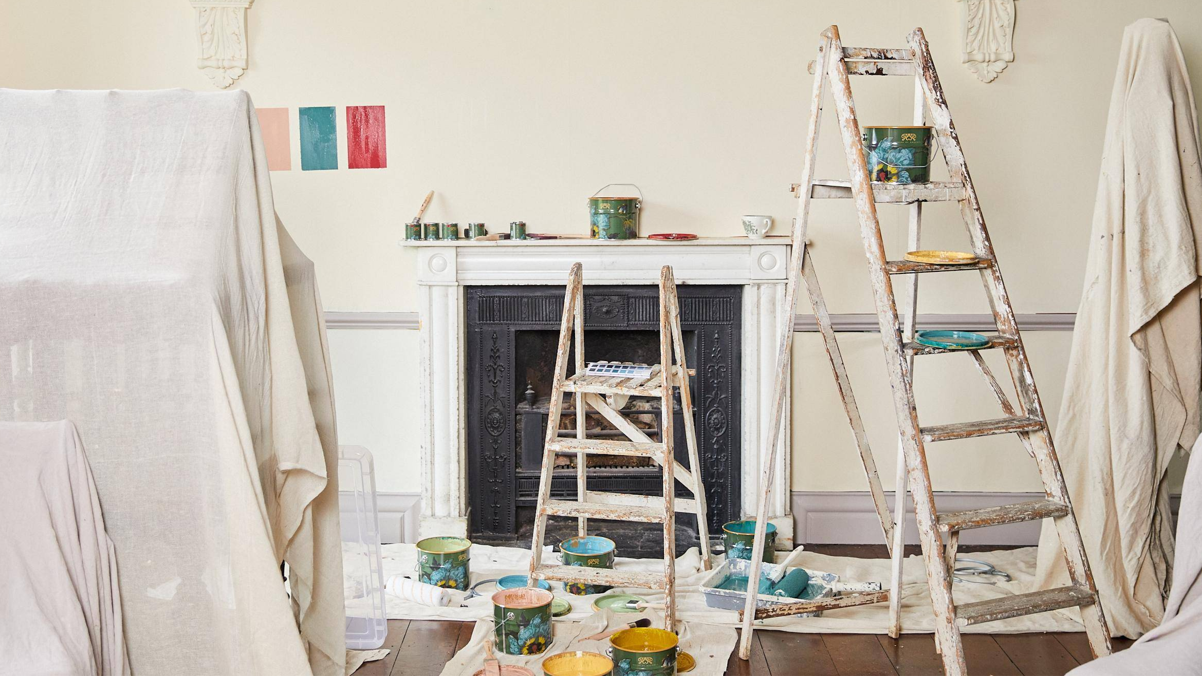
Complimentary Interior Design Services
We have long guided those who step into our House along their interior journeys.
With a decade of experience advising our customers on all things colour, print and decor,
the House of Hackney team are experts at bringing the harmonious balance of Nature into the home.
All of our services are complimentary, and available virtually via video call, or in person at our London and New York showrooms.
Home appointments are also available upon request.