


COLOUR MATCHES MADE IN HEAVEN
Romeo and Juliette, rock ‘n’ roll, print and paint - some things just go together. And in Nature? Endless possibilities for harmonious pairings. The ocean meeting the sky, verdant leaves against brown bark, the striking black and copper of a tiger’s coat; you can’t go wrong with Nature’s palette.
All of the colours in The Art of Nature paint collection are swatched from the natural world. From statement shades to tranquil tones, we have paint for every print, and every personality.
Whether you want to coat all four walls with wonder or are curious about how to introduce the hues and patterns of Nature into your space, follow us as we guide you through your colour journey. We’ll show you how to pair your perfect hue with print, through wallpaper, fabric, curtains & blinds and flooring, and style your space using the shades of Mother Nature to bring balance and beauty into your home.

1/3
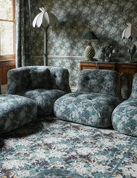
PAIR WITH PRINT
The first thing to consider when matching paint with print, is what kind of feeling you want to evoke.
Want to make a bold statement? For a more maximalist aesthetic, pick a paint that contrasts with your print (or vise versa). You can do this by looking at the opposite shade on a colour wheel, or choosing an accent colour that pops on your print.
If a minimalist, or more balanced approach to colour is more to your taste, imbue your space with an understated softness by selecting a matching, or muted tone from your print to create colour cohesion.

2/3
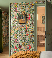
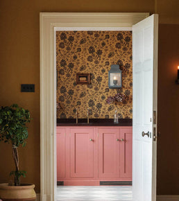
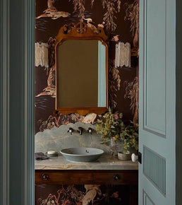
WONDER WALLS
Wallpaper has the power to completely transform any space; imbuing it with beauty and personality.
Whether you want to complement the tranquil tones of your wallpaper or make a maximalist statement with your print and paint pairing, we encourage you to start with the heart. Haven’t chosen your wallpaper yet? Follow our guide to picking the perfect print here. After you've found your dream print, choose a paint shade that echoes the background of your wallpaper to instil balance and harmony, or go wild with a contrasting colour to create a cohesively captivating colour palette and make your paint pop.

3/3
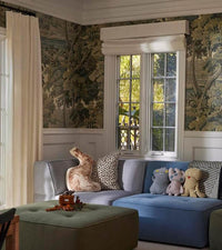
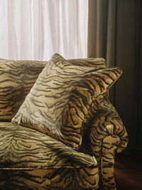
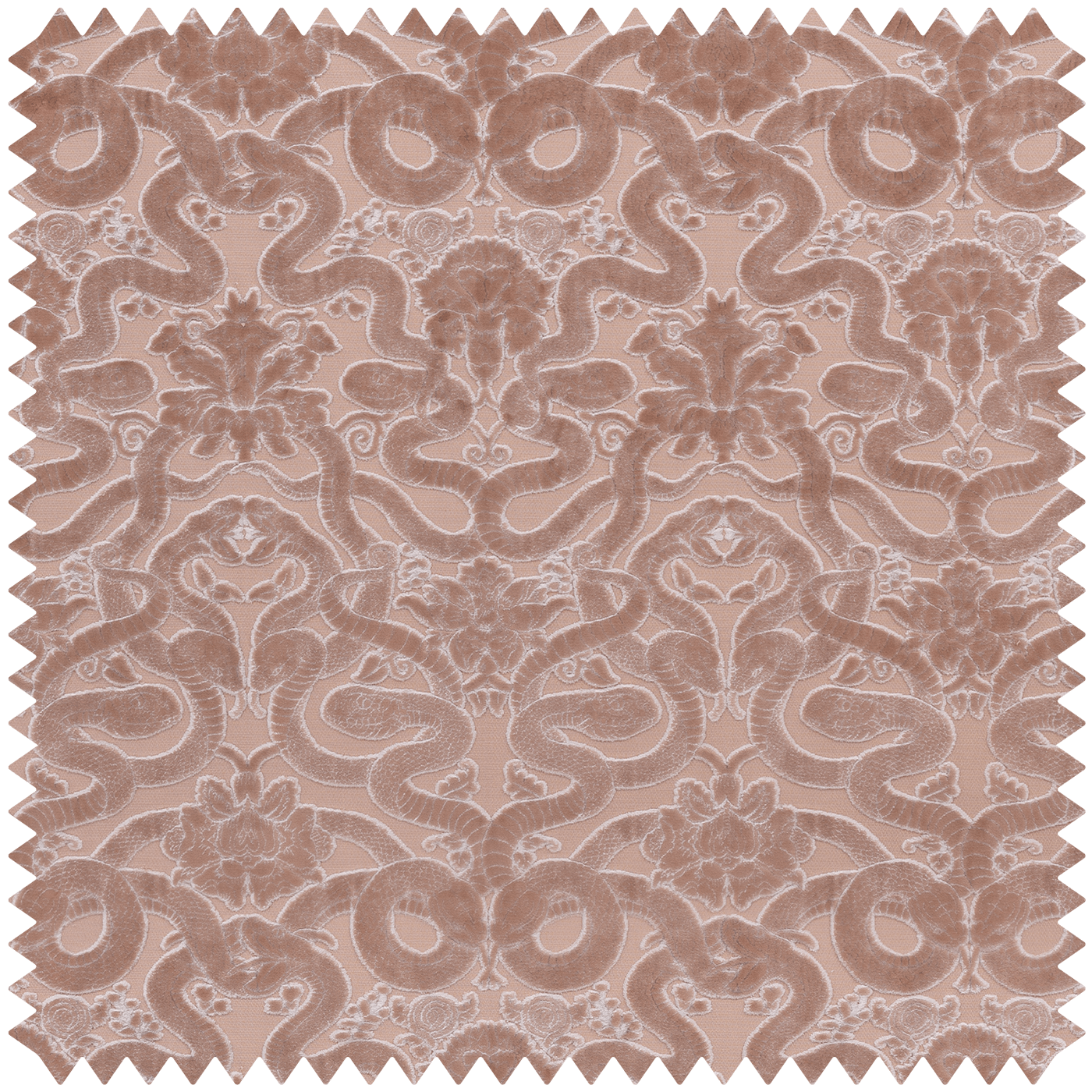
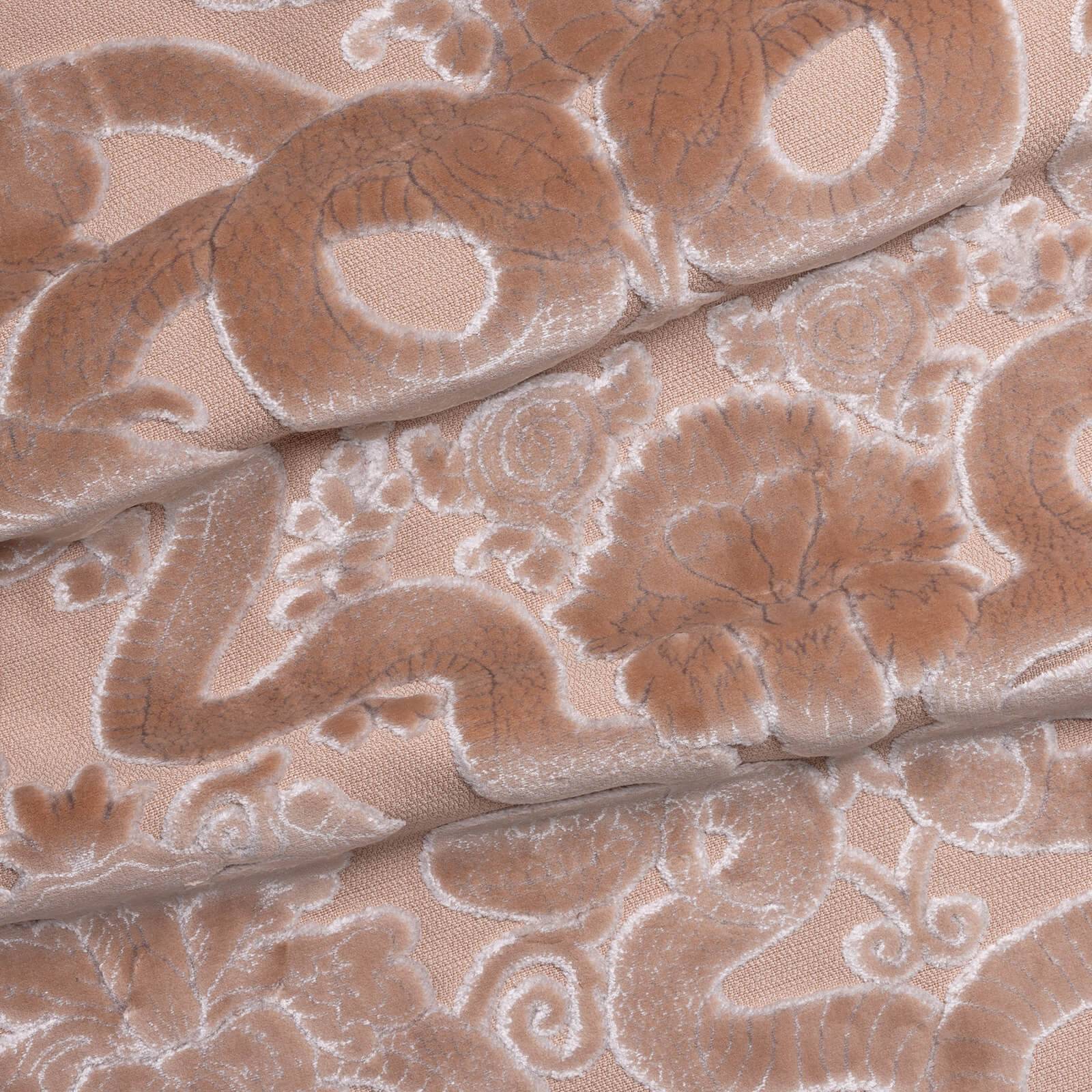
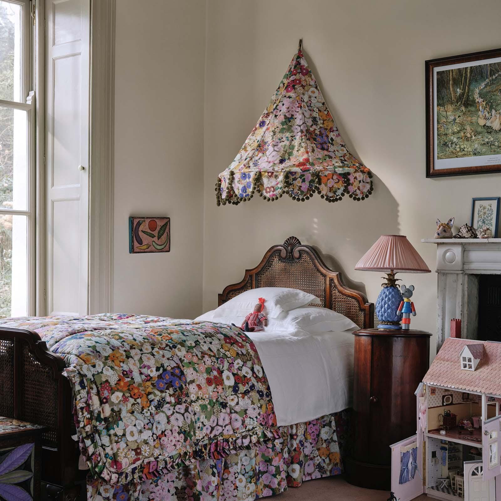
FABULOUS FABRIC
Fabric is such a versatile way to introduce print, colour and texture to a home, whether that’s through a new sofa, an upholstered headboard, a revamped seat or a couple of cushions.
Much like pairing with wallpaper, you can harness the tranquil tones of Nature by matching your fabric with a harmonious hue, or use paint as an accent by picking out a contrasting colour.
You can also breathe new life into your old furniture with paint. A great way to reuse and re-invigorate your existing pieces and add a pop of colour to your interior, our low-sheen, eggshell paint is perfect for transforming dull dining chairs and outdated kitchen cabinets. So unleash your inner Picasso and get creative!
Featured Products

1/3
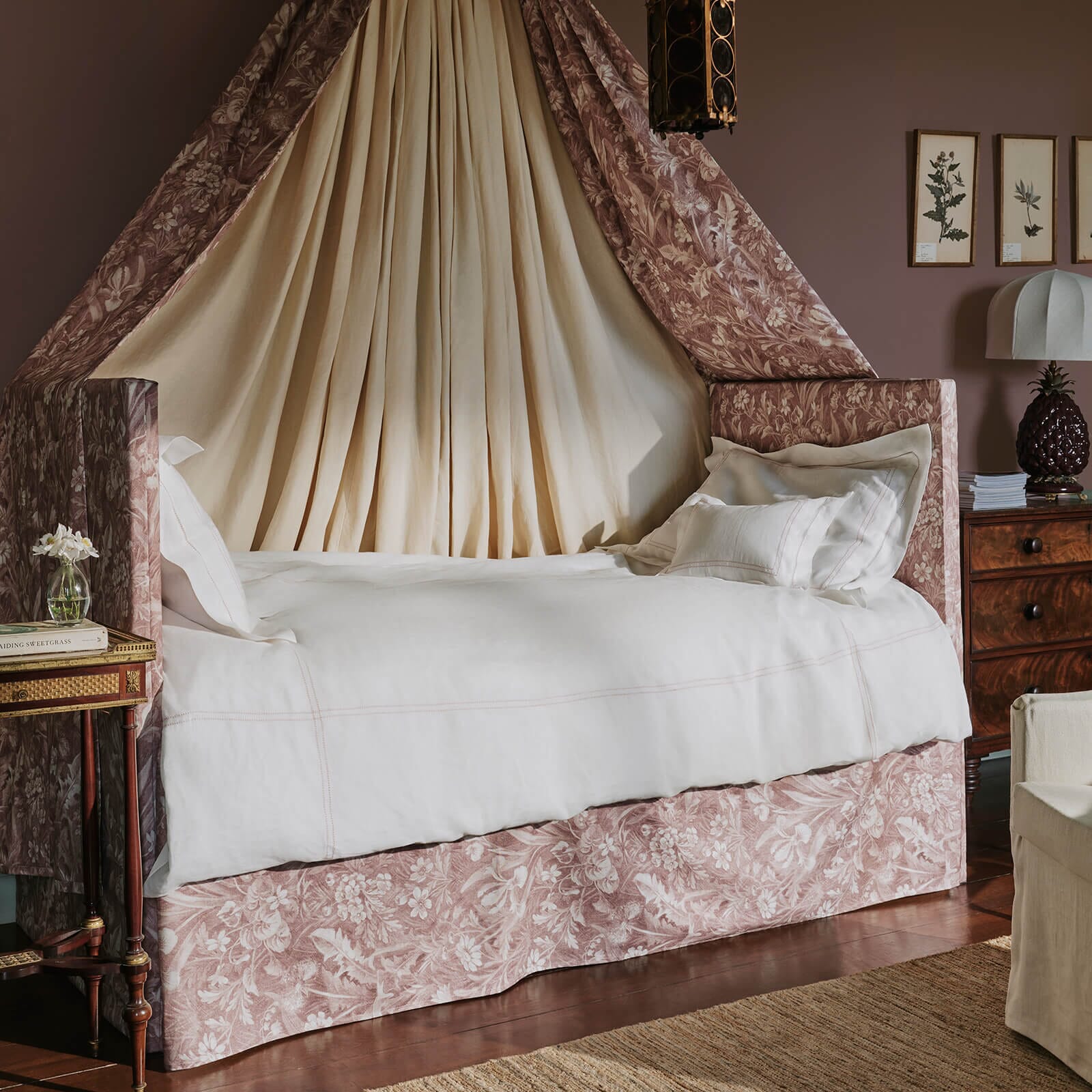
DREAM DRAPES
Make a statement with your soft-furnishings and swathe your space in colour. Choose fabrics that contrast with your chosen paint shade to create visual interest and don’t forget about texture; the chalkiness of our matte emulsion paint, paired with our sumptuous velvet prints is a match made in heaven. If an all out pattern clash isn’t for you, offset prints with neutrals to create balance and ground the room, which will let the pattern sing.

2/3
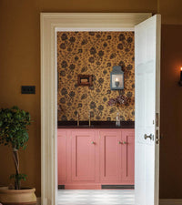
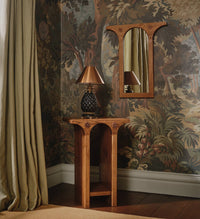
THE DETAILS
When it comes to painting woodwork, dare to be different. When considering what shade to paint your doors, dados and details, white isn’t always right! We see this as an oft-overlooked opportunity to create an extra layer of luxury, courtesy of our timeless, chalky eggshell finish.
Painting your woodwork the same shade as the walls creates a cocooning, colour-drenched effect, while picking out a hue from your wallpaper to colour your trim will really make your print pop.
And you don’t have to stop with the dados; go all out and colour bookshelves, radiators and architectural details to really make a statement.

3/3
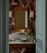
THE FIFTH WALL
Take your colour palette to new heights with the fifth wall. Often overlooked, considering the ceiling in the overall design of a room can be a powerful move in creating unexpected impact.
If you’ve wallpapered the walls, using a complementary paint shade on the ceiling can bring the two together, forming seamless cohesion, or if you’ve painted the walls, you can paper the ceiling for an irreverent pop of print, whilst keeping the rest of the room a block colour. Or if full print saturation is your thing, painting coving or woodwork can create a statement, or hold everything together, depending on whether you choose a matching, or contrasting shade.
Certain to add character, including the ceiling can even make a room feel more spacious, so bring some drama to your domain and get creative with colour.
Featured Products

1/2
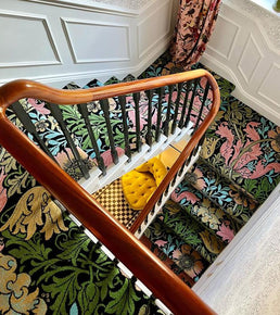
MAGIC CARPET
Build your scheme from the floor up! Flooring can really pull a design together - a great tip to create colour harmony is to choose a shade from a detail in your carpet or rug and use this to paint the walls. House of Hackney paint is the perfect accompaniment to our luxury floor coverings. Made by Axminster Carpets from the softest British wool, complement our print carpets and runners with the harmonious hues of Nature and create a riot of colour and texture.

2/2
FINISHING TOUCHES
Paint provides the perfect backdrop for your personal possessions. Colour blocking is a playful way to highlight your decor - use different tones from the same colour family to create a coulure-drenched focal point behind shelving and art pieces, or choose a contrasting shade for your walls or the inside of cabinets to make your collections really stand out. Complement your ideal hue with treasures and trinkets that make your paint pop - think sumptuous velvet cushions, luxury rugs and our iconic playful lamps.

Ready, Set, Swatch.
Ready, Set, Swatch.
Found the perfect paint pairing for your favourite House of Hackney print? It's time to order a swatch or sample pot. Painted for a finish and colour true to life, swatches are available in matte Emulsion only. For our Eggshell paint the finish will vary slightly to the Emulsion swatch.
Want more?