


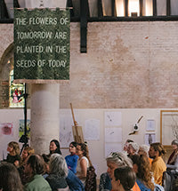


By House of Hackney August 15, 2024
How to Match Paint with Print: Colour Matches Made in Heaven

Our Guide on Pairing Paints with your Prints
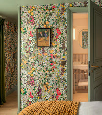
Have you found a favourite wallpaper but need some guidance on a complementary woodwork colour? Perhaps you’ve found your dream House of Hackney
curtains or sofa and need a little help with the perfect paint hue for your wall or ceiling?
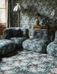
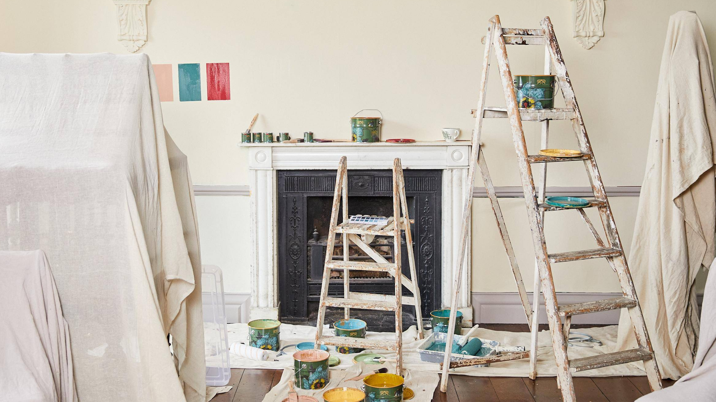
Whether you're creating a serene scheme or opting for a more creative and colourful aesthetic, here are some tips on how to pair our prints with our nature-inspired paint collection, and create colour harmony in your home.

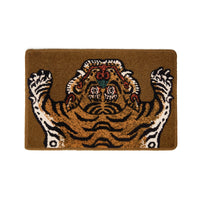
1/3
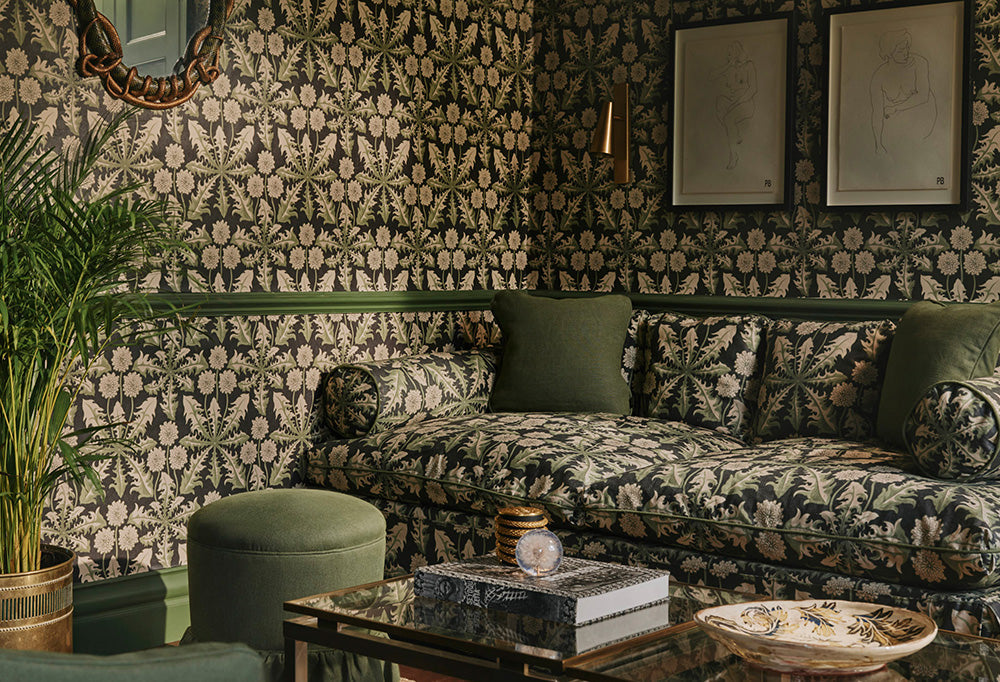
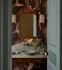
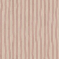
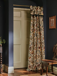
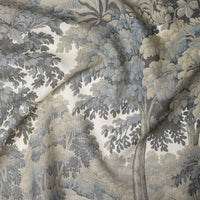
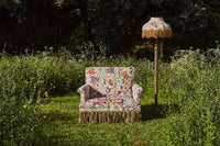
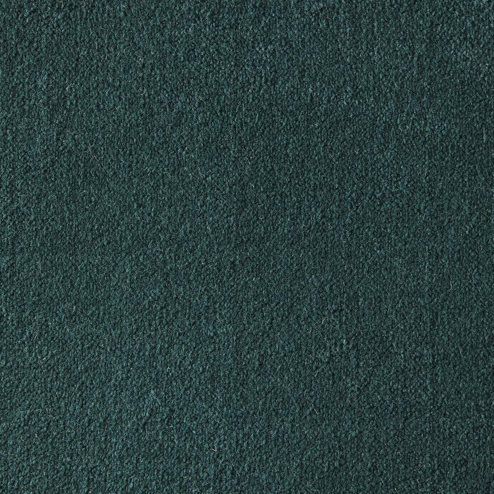
HARMONISE HUES
Selecting a shade that matches the background shade of your chosen print brings a cohesive feel to your room.

2/3
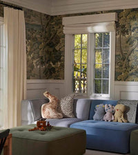
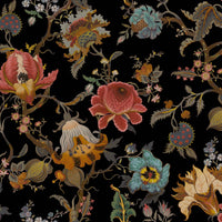
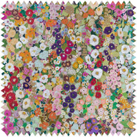
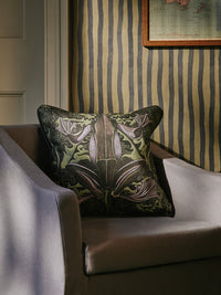
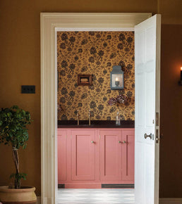
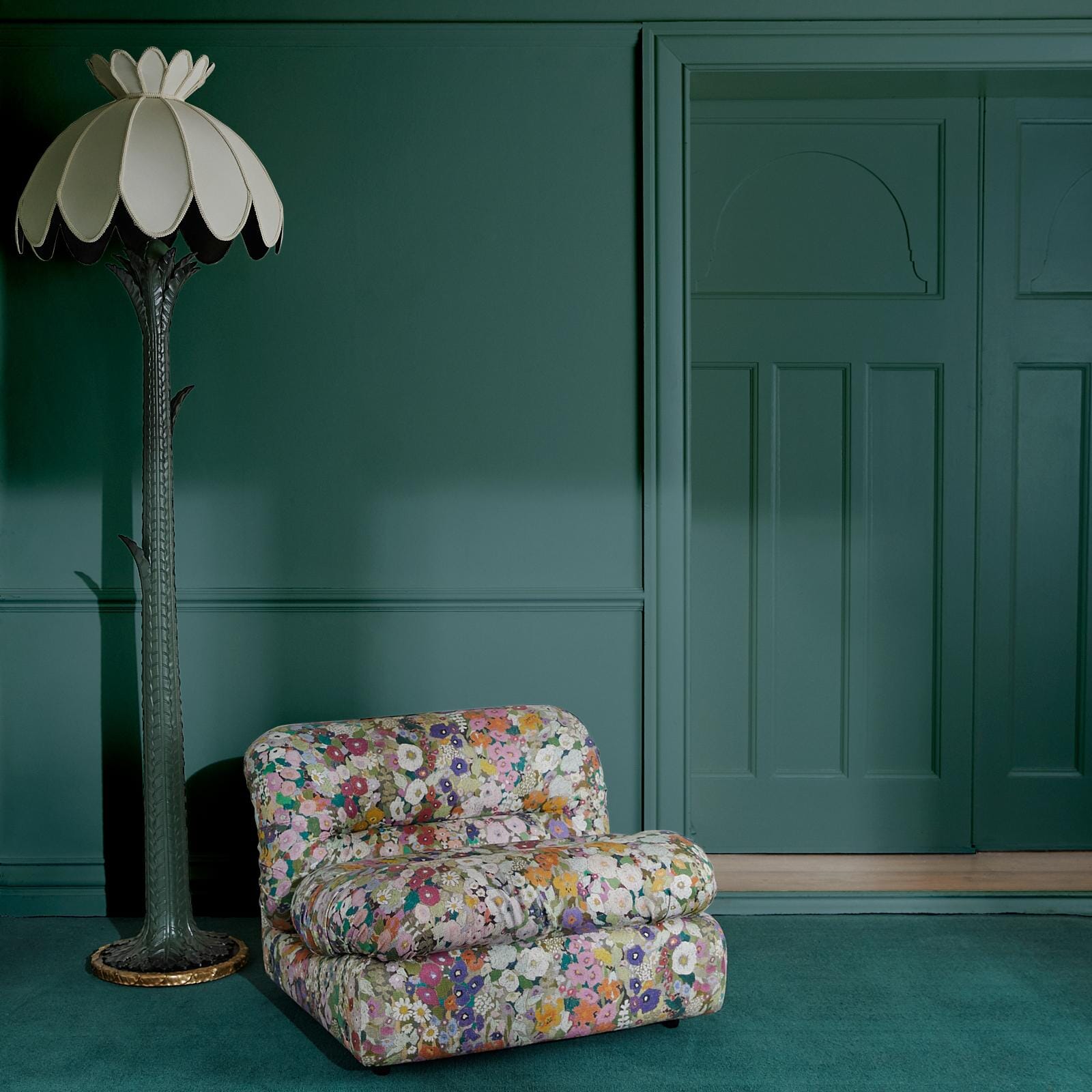
MAKE A MAXIMALIST STATEMENT
For a bold maximalist aesthetic, pick a paint that contrasts with your print. The end result will still feel harmonious as you will have crafted a cohesive colour palette.

3/3
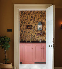
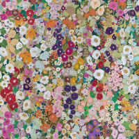
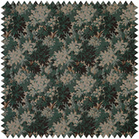
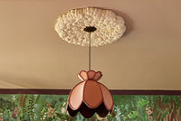
HARNESS TRANQUIL TONES
If a minimalist approach to colour is more to your taste, imbue your space with an understated softness by selecting a muted tone from your print to match your paint to.
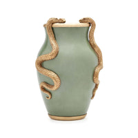
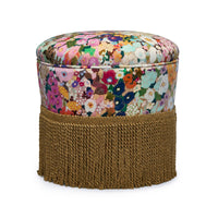
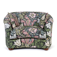
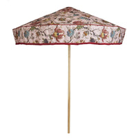
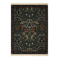
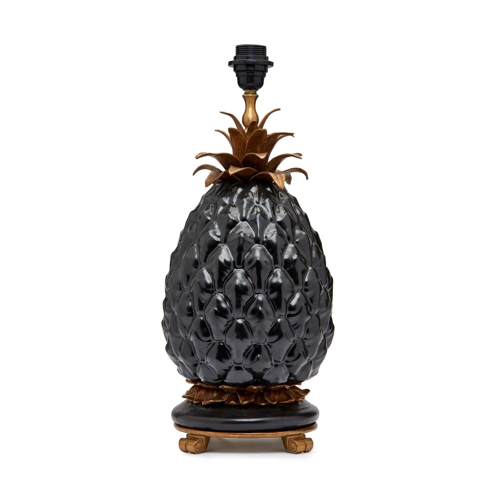
Featured Products


Only a few left
Serpentis
Mirror - Verdigris
£895.00

Ready, Set, Swatch
Found the perfect paint pairing for your favourite House of Hackney print? It's time to order a swatch or sample pot. Painted for a finish and colour true to life, swatches are available in matte Emulsion only. For our Eggshell paint the finish will vary slightly to the Emulsion swatch.

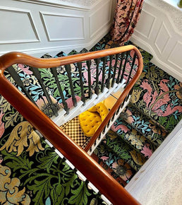
1/3
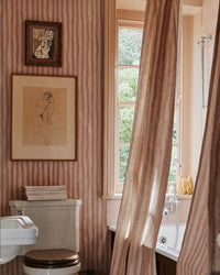
HALF AND HALF
A nod to traditional schemes, why not try pairing print above or below a dado rail? It can work well either way, but we recommend keeping darker colours below the rail and lighter above - this will not only make your room feel lighter but taller too.

2/3
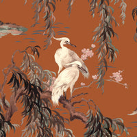
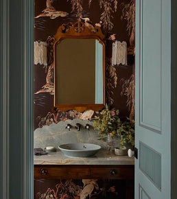
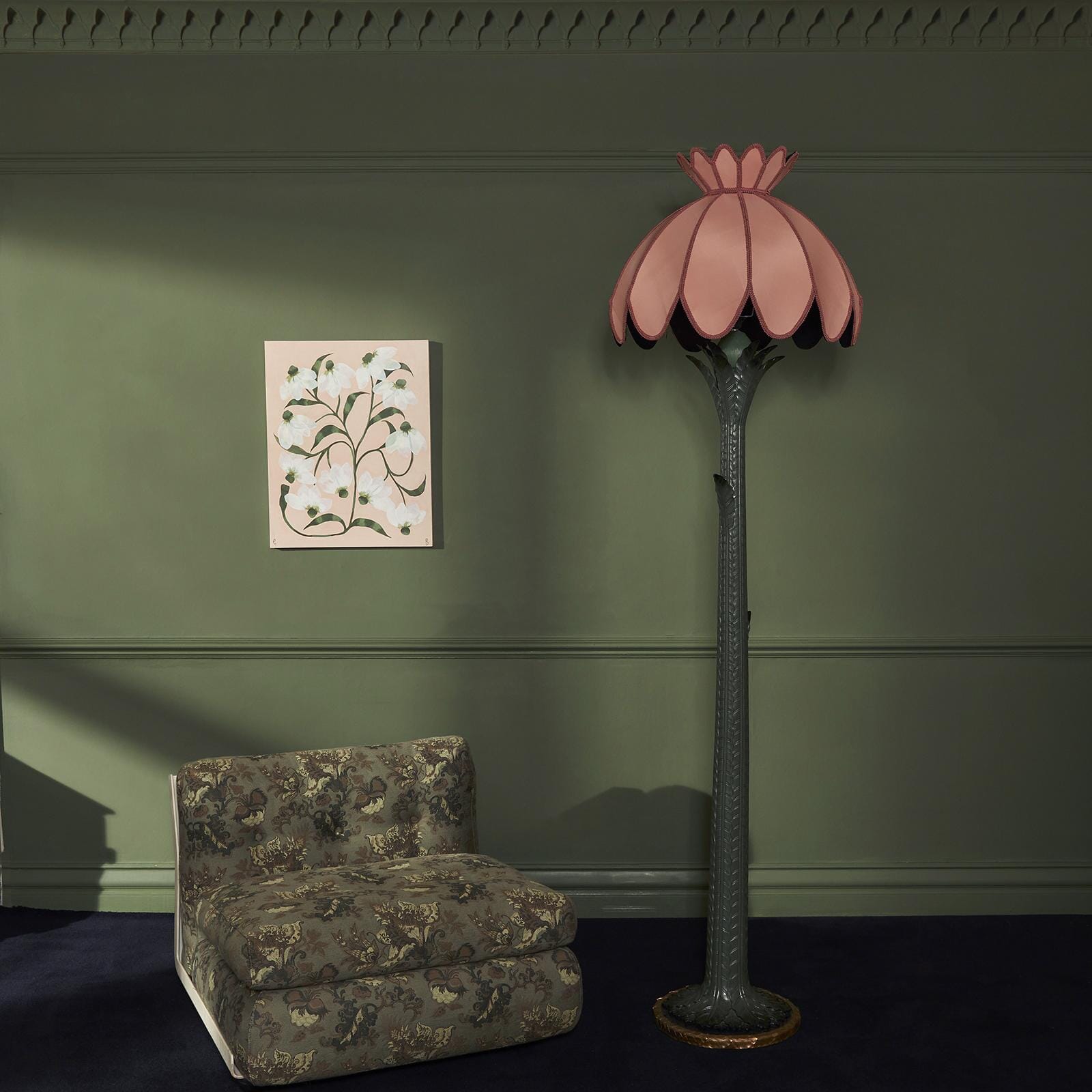
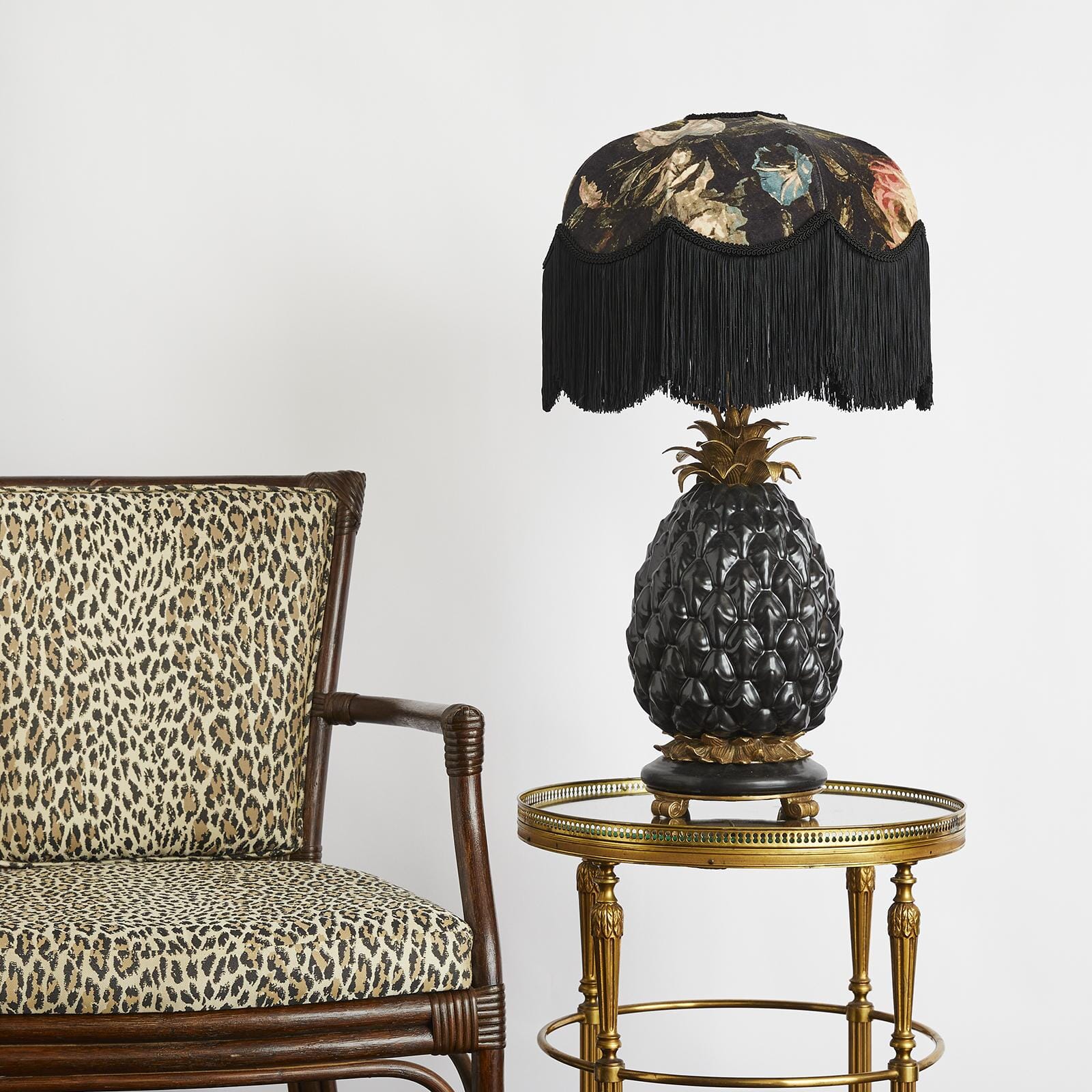
WHAT ABOUT WOODWORK?
Dare to go dark. When selecting the colour of your woodwork to complement your chosen print, we recommend picking out a darker detail from the design and matching your paint to this.
Not only will this add an extra layer of luxury to your space, it will also establish a more regal mood.

3/3
THE FIFTH WALL
Take your colour palette to new heights and pair your print with a painted ceiling.
Often overlooked, considering the ceiling in the overall design of a room can be a powerful move in creating unexpected impact. For a light and airy finish, select a hue that is a few shades lighter than those that appear in your print. Or if you dare to go to the dark side, opting for a darker hue can have a cosy, cocooning effect.
Featured Products
Want more?